A picture may be worth a thousand words, but when a star explodes, a flame burns or cells divide uncontrollably into a metastatic cancer, a picture also is worth millions of numbers – dimensions, time, tension, temperature, friction and myriad other variables that help form vivid images and tell a complex story.
More formally known as visualizations, these representations “have become an indispensable tool,” says Kenneth Moreland, a Sandia National Laboratories (SNL) computer science researcher who builds the latest software-driven methods to render visualizations from mountains of raw data. “Visualization broadens human understanding.”
Kenneth Moreland
Moreland is a principal investigator at the Institute for Ultra-Scale Visualization, or UltraVis, a branch of the Department of Energy’s Scientific Discovery through Advanced Computing (SciDAC) program.
“Ken has made particular contributions to the advancement of parallel visualization,” says Kwan-Liu Ma, UltraVis director and University of California, Davis, computer science department chairman. “He has also been disseminating and deploying our research innovations.”
Moreland is helping tackle what Ma calls “the most challenging problems facing scientists who use the most powerful supercomputers in the world to study the most difficult and important problems in science” – by developing new visualization techniques in climatology, astrophysics, combustion research, fusion, material science and other areas. “As almost all fields of study become more data driven, scientists should use visualization to validate results, discover previous unknowns and communicate their work.”
Besides UC-Davis and Sandia, the UltraVis partnership includes Argonne National Laboratory (ANL), the University of Tennessee and Rutgers and Ohio State universities.
Moreland says he and his coworkers have spent the past decade building parallel computing algorithms that still are evolving. “Our current tools demonstrate excellent scalability on today’s high-performance platforms,” meaning they continue to operate efficiently even as the computers they run on get bigger. “But the nature of parallel computing is always changing.”
Ma underscores the urgency of Moreland’s research. “The deployment of new technologies to support data analysis and knowledge discovery is lagging. Many scientists still rely on old technologies that are not compatible with the growing size and complexity of the data their studies generate.”
‘We do not want the user interface to interrupt thought or constrain exploration.’
Moreland is perhaps best known for ParaView, supercomputing’s answer to Excel, Access, Mathematica and other popular desktop software designed to handle data by the megabyte (a mere1 million bytes). ParaView can interpret datasets in the terabyte, petabyte and exabyte (trillion, quadrillion, and quintillion bytes, respectively) range to produce visualizations on parallel systems large and small.
“You can run ParaView on your desktop for small files,” Moreland says, “or use it in client-server mode on computers with hundreds of processors.”
Robert Ross, an ANL computer science researcher who works with Moreland, notes that Moreland’s job continues even after he innovates, working with DOE scientists to help them use ParaView. Moreland, Ross adds, helps integrate UltraVis software innovations into the ParaView package.
Moreland also is a leader in an open-source visualization software toolkit known as Dax – short for “data analysis at extreme.” Dax, supported by DOE’s Office of Advanced Scientific Computing Research, is being built to operate on computers capable of an exaflops (a quintillion computations per second) or of handling an exabyte (a quintillion bytes of data).
Dax breaks heavyweight computational tasks into lightweight automated functions that work on single data elements. Dax can integrate an indefinite number of these functions, Moreland says, allowing the developer to focus on the details of the visualization algorithm, rather than the intricacies of a parallel system.
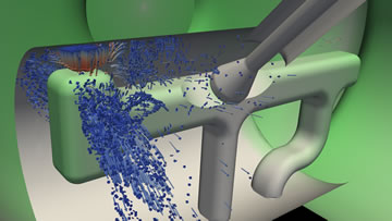
A visualization usually starts with an independently executed simulation that solves mathematical equations, producing a computer-generated model stored on a disk. Simulations generate discrete numbers – or groups of numbers called fields – that quantify physical properties such as temperature, pressure, density, mass, velocity or electrical conductivity. “The value of these fields varies over space and time,” he says. “Most, but not all, fields are connected by a topology.”
A topology is a geometric structure that describes how an object shape changes under physical deformations such as stretching or twisting. A simulation might describe how increasing temperature deforms a plastic container or how an earthquake shock wave turns calm ocean waters into a tsunami. As such, topologies combine the variable space of each field with physical space – length, width, height and time.
After it loads and processes stored simulation results, a visualization algorithm can transport simulated topologies that describe certain physical phenomena anywhere in space and time, visually reproducing how the phenomena might behave under a different set of conditions.
Moreland cites the simple example of a traumatized container, be it a paper carton that explodes under the gaseous pressure of spoiled milk or a steel sarcophagus covering an overheating nuclear fuel rod.
“The intention of a visualization is to determine whether the container will keep its contents safe in a hostile environment,” he says. “A simulation could report whether stress on the container exceeds its failure point. But that does not explain the conditions behind the failure. An interactive visualization provides more insight.” That insight includes the distribution of stress over the container, material uniformity and weak points.
Does the failure occur because of a load, an impact or being pierced by something else? Does the container crumple where expected and remain rigid where designed? How can the container better withstand the forces? A precision visualization can help answer each of these questions, Moreland says.
It’s no easy feat to achieve seamless teamwork between supercomputer programs for simulation and visualization, a pairing that starts with a good user interface: those parts of a program – a desktop icon or a browser toolbar, for instance – that accept input from or provide output to a user.
“Visualization enables a processing loop between human and computer, and the user interface is a key component in this loop,” Moreland says. “A good user interface feels natural, whereas a bad user interface is frustrating and requires considerable thought to manipulate correctly.”
For this reason, user interface design is a critical component of Moreland’s research. “We do not want the user interface to interrupt thought or constrain exploration.”
How computers interface with each other, rather than the user, is another important design element. Large data sets necessitate so-called distributed-memory parallel computing – many computers operating in tandem. Highly specialized supercomputer software provides the interface integration that pulls teams of human operators and computer simulators together.
Moving data to and from disk involves a widening gap between computation, file transfer rates and the growing cost of disk storage. An alternative – in situ visualization – runs simulation and visualization simultaneously. Rather than write simulation data to disk, the visualization emerges while the data still are in the supercomputer’s working memory.
Moreland is now working with other SNL computer scientists to improve ParaView by streamlining the user interface and updating algorithms to provide “a simple, powerful, and flexible mechanism for in situ visualization,” he says.
“Until recently, in situ visualization has been a niche specialty. But with petascale computers, it’s often infeasible to store enough data to do a proper analysis, so we are moving to make in situ a common mode of visualization.”