Science and engineering, long reliant on abstract symbols, graphs and models to represent the real world, can now also step through the looking glass.
Computers can construct and display mirror images of increasingly detailed pieces of nature in action, generating visual understanding that can rival observation, all in a virtual world where the discoveries seem very real. But there is a caveat. As the saying goes, seeing is believing, so scientists must take extra care to remember that all simulations include some degree of error and uncertainty.
Visualization uses images to promote understanding and communication. From the scout for a prehistoric hunting party scratching a herd’s location in the dirt to a team of astrophysicists animating a star’s explosion in 3-D, expressing abstract ideas through visual metaphors seems innately human.
“I’m certainly biased, but my view is that visualization is really part of the thinking process,” says Chris Johnson, director of the Scientific Computing and Imaging (SCI) Institute at the University of Utah. “We are very visual creatures. More than half our brains are used for some sort of image processing. When I think of visualization, I really think of visual data analysis or visual thinking.”
Johnson and Wes Bethel of the National Energy Research Scientific Computing Center (NERSC) and the Visualization Group at Lawrence Berkeley National Laboratory (LBNL) co-direct the Visualization and Analytics Center for Enabling Technologies. VACET is part of the Department of Energy’s Scientific Discovery through Advanced Computing (SciDAC) program.
“Visualization works,” Bethel says, “because it is able to effectively leverage a high-bandwidth link into one of nature’s most advanced signal processing systems: your brain.”
A few seconds of animation may consume a million processor hours of computing time.
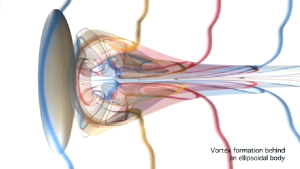
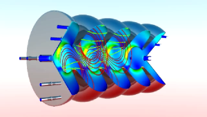
Flow dynamics simulations like this one show promise for replacing expensive wind-tunnel experiments and other empirical tests.
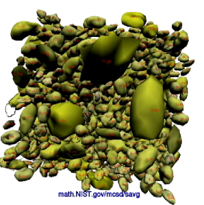
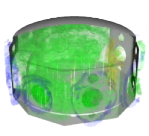
Computer models and visualizations like this help scientists predict concrete’s behavior, providing insights to maximize strength and durability while limiting the impact on cost and workability.
This animation shows a small segment of a white dwarf star and the rapid nuclear burning that lasts only a few seconds before the star explodes as a type Ia supernova.Like any motion picture, a scientific visualization presents a final cut: selected and processed data from much larger data sets. Visualization can reveal underlying meaning and structure in science and engineering data, typically generated in simulations that incorporate mathematical computation and geometric models.Johnson explains.
Like any motion picture, a scientific visualization presents a final cut: selected and processed data from much larger data sets. Visualization can reveal underlying meaning and structure in science and engineering data, typically generated in simulations that incorporate mathematical computation and geometric models. Johnson explains. “I’m drinking a cup of coffee – a double latte – right now. Let’s say that I made this too hot when I oversteamed the milk, and I would like to understand when it is going to be just the right temperature for me to drink.
“As a physics problem I would need to model the physics of the thermodynamics of the temperature. And if I really wanted to make this accurate I would have to model the geometry of the coffee cup, and I would have to take into account the material properties of the coffee cup.
“Then I would need to approximate that mathematical model in this geometric computer model and that is the computer simulation where I would approximate the continuous mathematics. I’m going to see a visualization of the decrease in temperature over time as my coffee cup sits there interacting with the air around it.”
A single visualization now can display data in the terabytes (a trillion bytes) and petabytes (a quadrillion bytes). Compare that to Google, which processes about 20 petabytes a day. A few seconds of animation may consume a million processor hours of computing time, but the payoff can be an exquisitely detailed vision of realms no experiment can probe. And increasingly powerful computers are leading to higher resolution views of simulated reality at extremely fine grain – even at the atomic level.
A high spatial-resolution visualization of sea-surface temperature reveals eddies at the equator and other climate events.
Subatomic particles can be made to “crab,” or move sideways, by magnetic fields in a cavity. Simulations like this can predict how these fields interact with cavity walls to generate heat.
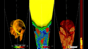
Igniting fusion by imploding hydrogen pellets with high- powered lasers also generates electromagnetic (EM) pulses that can damage equipment. This simulation shows EM field results for a laser facility.
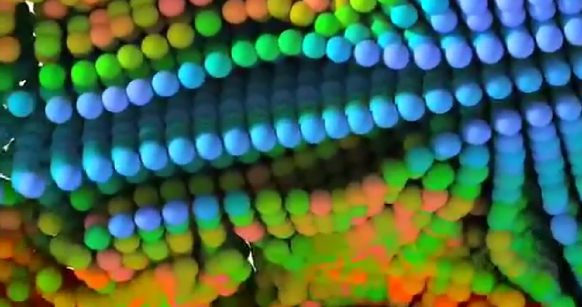
A simulation of an enzyme found in white rot digesting a million atoms of plant cellulose, for example, models a process that humans would like to recreate to make fuel from wood waste. (See the visualization “Cellobiohydrolase Action on Cellulose.“)
Michael Crowley, senior scientist at the National Renewable Energy Laboratory in Golden, Colo., created the simulation in collaboration with Cornell and Pennsylvania State universities. Crowley is lead principal investigator for a SciDAC life sciences project and NREL is a partner in the BioEnergy Science Center (BESC) under DOE’s Office of Biological and Environmental Research (BER).
“You don’t see all the million atoms because you wouldn’t be able to see anything,” Crowley says. “But in the calculation it’s all there.”
The simulation takes into account the angles and distances of all the chemical bonds among atoms, along with physical forces that govern the reactions.
“For each atom there are many thousands of interactions with other atoms that have to be calculated,” Crowley says. “You end up needing a lot of compute power for every single time step, and we need to take many millions of time steps to make any sense of what’s happening.”
Crowley doesn’t yet know exactly how the enzyme cellulase breaks down plant cellulose. That’s a goal of the simulation. “Once we have some ideas of the mechanisms based on the physics we have put into the model, we can make suggestions to the experimentalists &ndash ‘Try changing this amino acid to this one.'”
Experimental mutations to the organism may either destroy its functionality or increase the rate of cellulose conversion into sugar, the feedstock for ethanol fuel. The former would challenge the model while the latter would validate it but either result would generate data to improve the model. “It’s extremely exciting, and it’s something that you can’t get out in other ways,” Crowley says.
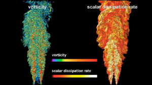
Simulating turbulent hydrogen flames lets scientists understand vorticity, dissipation and other qualities important to improving stability and efficiency.
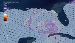
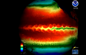
Output from a high-resolution computer simulation of Hurricane Katrina enables scientists to visualize rainfall and wind velocity at 10 meters in height.
The inability to visualize all million atoms in Crowley’s simulation is not uncommon. In fact, visualization scientists are urging application scientists to engage in on-site filtering of data for visualization, since it can take days just to port in a raw data set.
“There’s too much data,” says Kwan-Liu Ma, professor of computer science at the University of California at Davis and principal investigator for the SciDAC Institute for Ultrascale Visualization (UltraVIS). “We want to give the scientist control over what to show (and) how to visually represent a particular feature &ndash a pattern or structure or trend &ndash that they intend to study or to show to others.”
All scientific measurements have uncertainty – traditionally shown as “error bars” on charts – and as data is computed, processed and visualized, error can propagate with every time step. But, Johnson asks, “When was the last time you saw an error bar on a 3-D scientific visualization? We see these beautiful images that capture the geometry and the simulation results, but we still need to also capture the uncertainties and the errors that are in involved in the simulation process.”
How to visualize uncertainty is just one of the opportunities for adding meaning to scientific visualization. As the visualizations demonstrate, there is a true art to fusing scientific accuracy, explanatory power and compelling beauty.
Says Ma, “We want to combine the power of computing and the power of human perception. That makes our job fun.”